Front Color Combination Design Principles for Modern Homes.
Front color combination is no longer just about choosing two attractive shades. In modern architecture—especially across the US, UK, Europe, Canada, and Australia—it is about how colors interact with light, textures, shadows, and gate design. A well-planned front color combination defines the home’s personality, enhances proportions, and turns the main gate into a visual centerpiece—just like a gemstone set perfectly in a ring. This guide explores design-driven principles that help homeowners create truly refined, global-standard elevations. I often think that it is the right choice of colors that makes an average building stand out, otherwise the wrong choice of color can ruin a good building.
1. Color as a Tool to Control Visual Proportions.
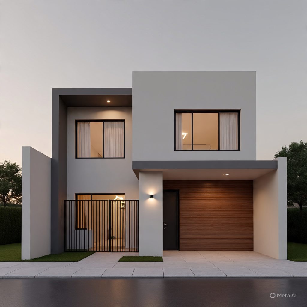
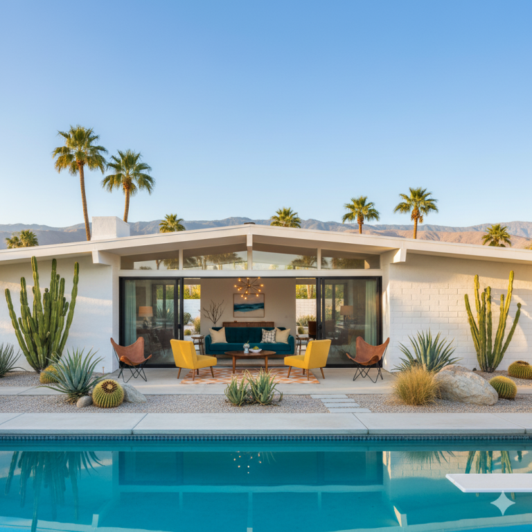
Light shades visually expand a façade, while darker tones anchor it. Smart front color combination uses lighter colors on upper levels and deeper shades near the base to create balance and stability.
2. Using Contrast to Highlight Architectural Lines.

Contrast defines form. When darker colors are used within grooves, frames, or recessed areas, they highlight architectural geometry. This approach is popular in minimalist elevations where clean lines must stand out without decorative clutter
3. Light Reflection Matters More Than Shade Selection.
In modern design, how a color reacts to daylight is more important than the color itself. Matte light tones reflect evenly, while textured darker shades absorb shadows beautifully.
4. Texture and Color Must Work Together.

A single color can appear completely different on stone, plaster, concrete, or wood. Modern elevations rely on texture variation, where the same color family is applied across surfaces to create richness without adding more colors.
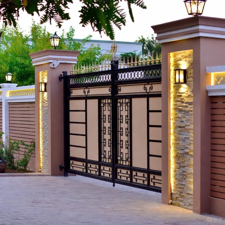
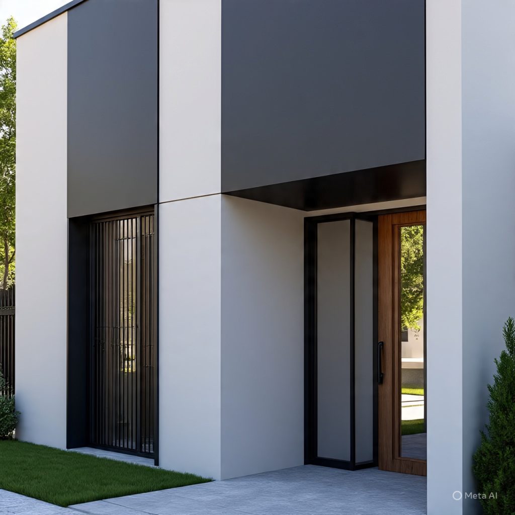
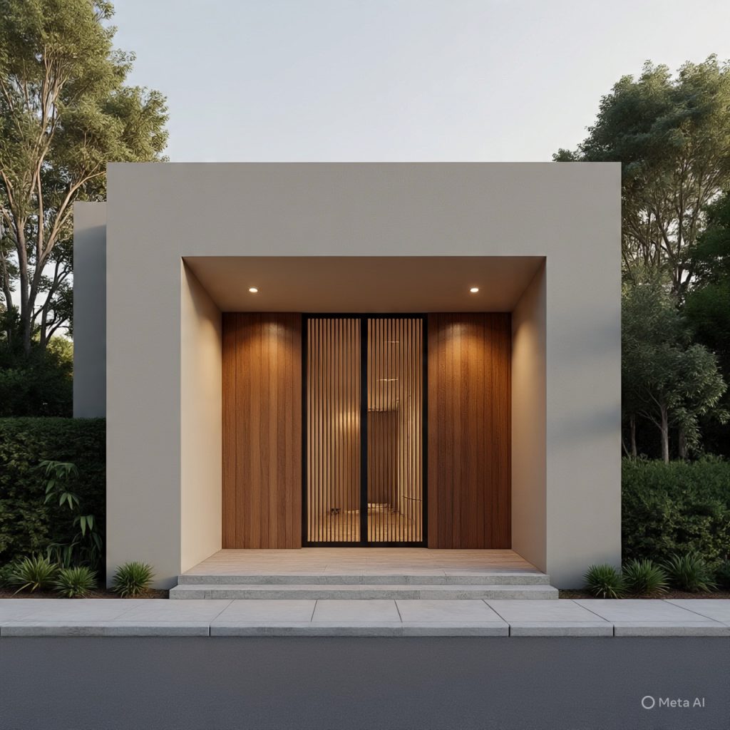
5. Gate-Centered Color Planning.
The main gate is the visual anchor of the front elevation. Wall colors should either frame or subtly contrast the gate so it stands out naturally—like a gemstone set perfectly in a ring. Ignoring gate color breaks harmony.
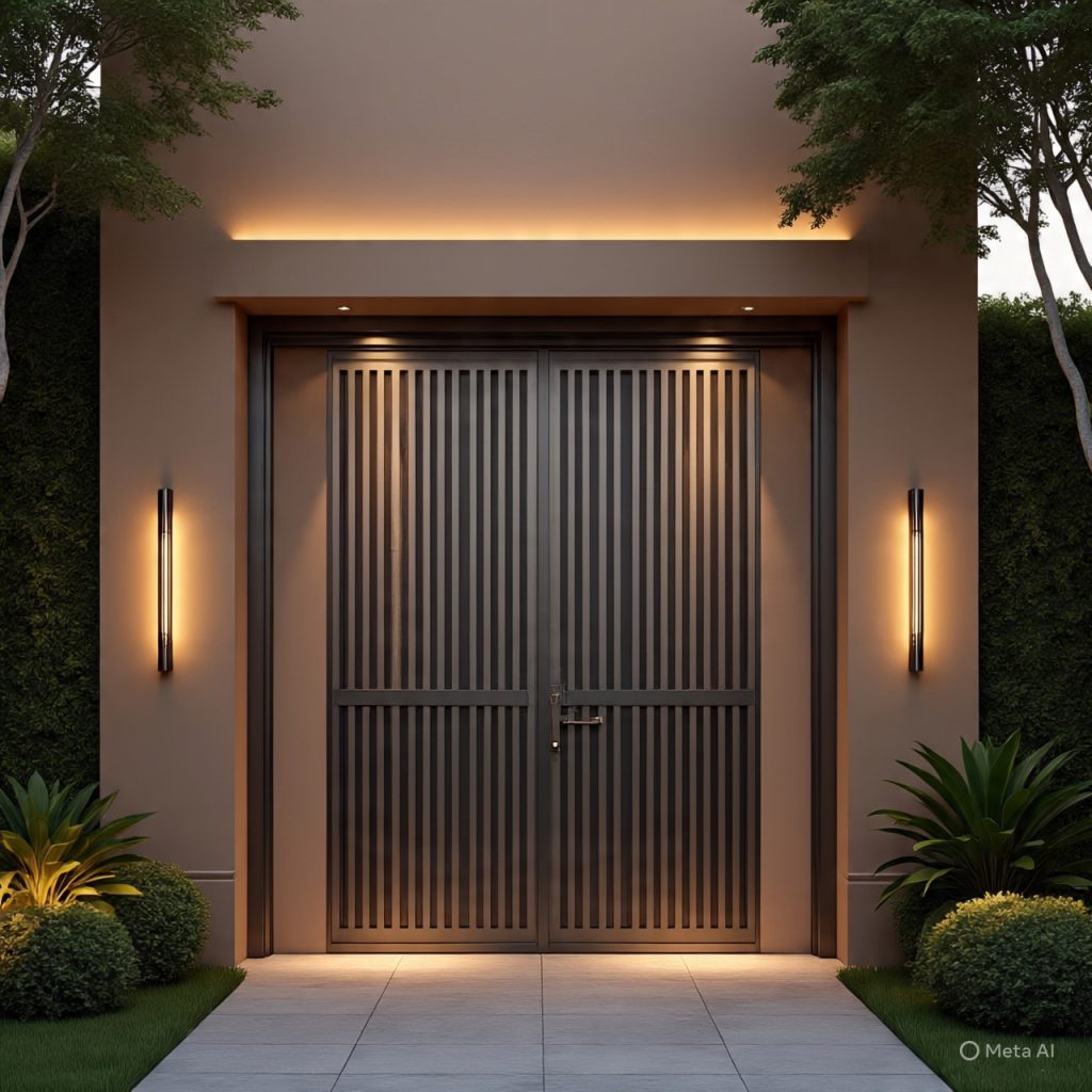
6. Night-Time Appearance as a Design Priority.
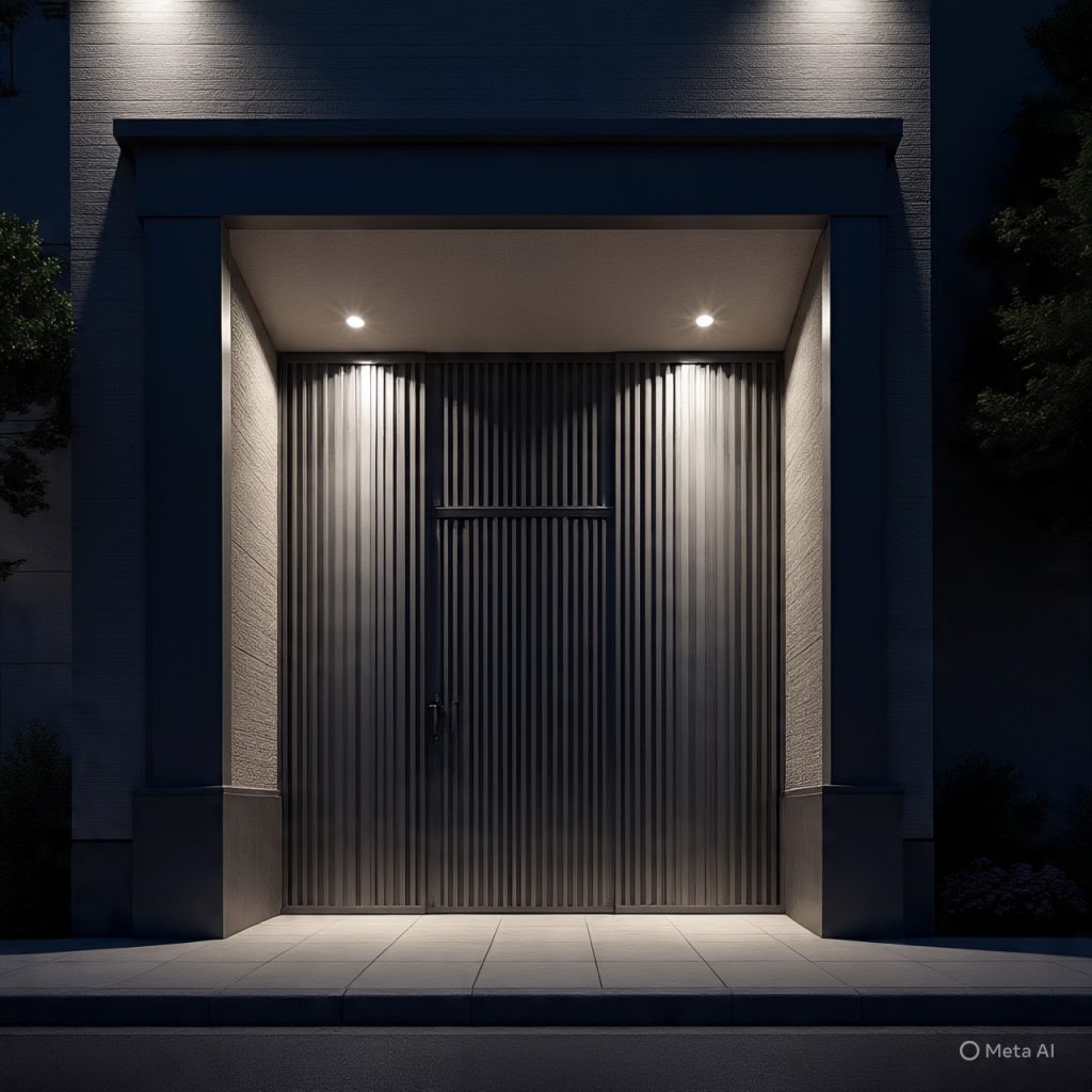
Modern homes are designed for 24-hour visual impact. Darker tones enhance warm lighting effects, while lighter shades maintain clarity. Layered lighting combined with balanced colors creates a premium night elevation
7. Limiting Color Count for Visual Calm.

Two to three tones are ideal. Overuse of colors distracts the eye and reduces elegance. Globally admired elevations maintain restraint, letting form and light do the work rather than excessive color play
8. Climate-Sensitive Color Selection.
In warmer climates, lighter shades reduce heat absorption. Cooler regions often allow deeper tones without discomfort. Modern front color combination design respects climate while maintaining aesthetic consistency
9. Symmetry Enhances Color Impact.

Symmetrical elevations allow colors to appear intentional and composed. When both sides mirror tone placement, the façade feels calm, structured, and luxurious—especially important for narrow fronts
10. Using Shadow Lines as a Design Element.

Projections, recesses, and cantilevered shades create natural shadows. These shadows add depth and drama, reducing the need for multiple colors while enhancing visual interest
11. Avoiding Trends, Building Timeless Appeal.

Trendy colors fade quickly. Neutral-based front color combinations remain relevant for decades, protecting property value and visual appeal. Timeless design always outperforms fashionable experimentation
12. Color as an Extension of Lifestyle.

Front color combination reflects personality. Soft neutrals suggest calm sophistication, while bold contrasts express confidence. A well-designed elevation tells a story without words.
Final Thoughts:
A refined front color combination is not about copying palettes—it is about design thinking. When colors are selected with respect to light, texture, proportion, and gate placement, the elevation transforms into an architectural statement. By focusing on harmony rather than trends, homeowners can achieve a modern, globally appealing exterior that feels premium, timeless, and visually unforgettable.
In my experience, a well-balanced front elevation design creates both visual appeal and long-term value. Use this guide as a foundation, adapt it to your needs, and build a design that feels modern, practical, and timeless.