Two Color House Front – Modern Color Combinations for Stunning Home Elevations
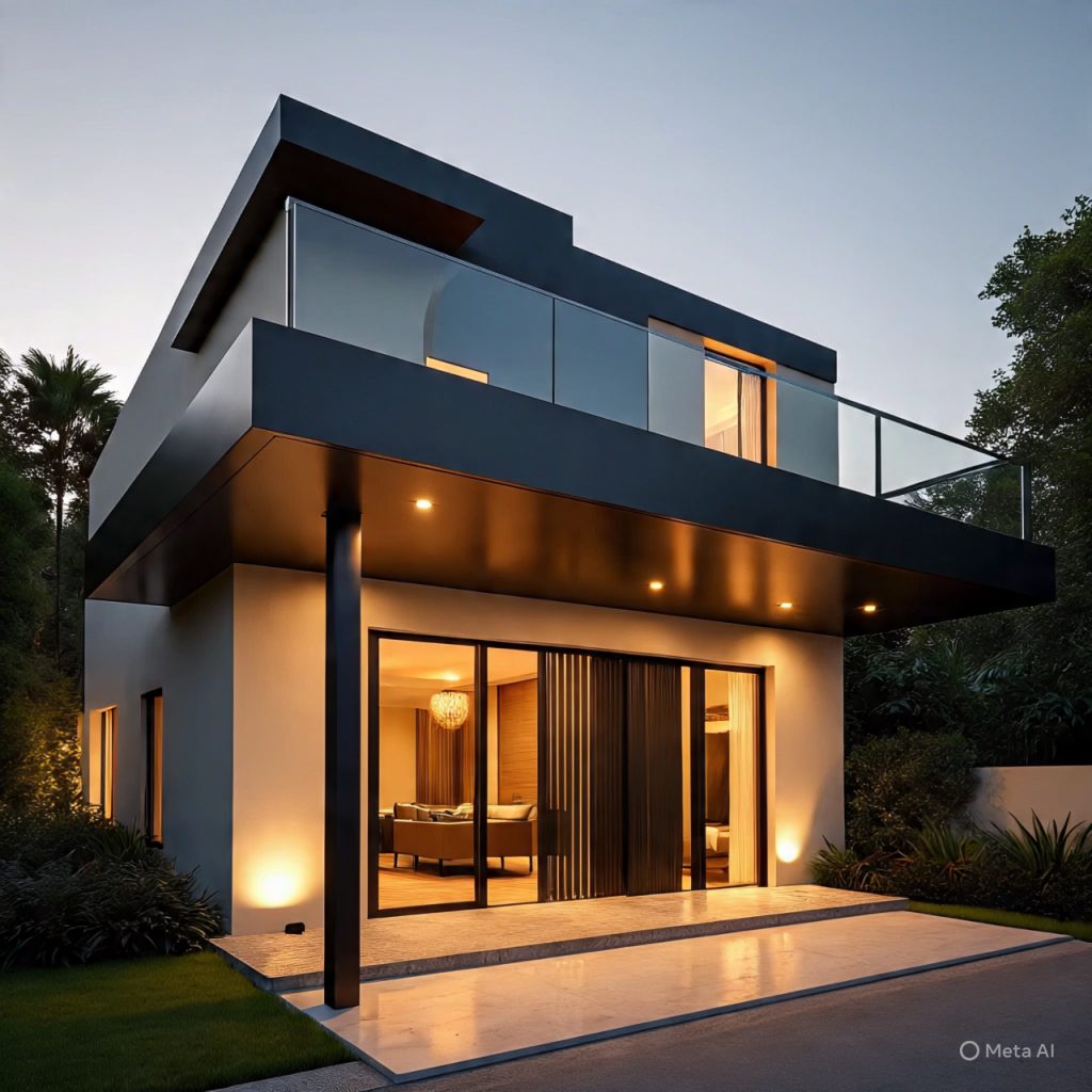
A two color house front is one of the simplest and most powerful ways to give any home a modern, premium, and visually balanced personality. Whether your house is compact or spacious, choosing the right pair of colors can highlight the architectural lines, emphasize the gate, and create a timeless impression from the very first glance. Today’s homeowners want elevations that look elegant in the day and glow beautifully at night — and two-tone palettes deliver exactly that.
Below are 15 carefully designed sections, each sharing inspiration and expert-level insights for achieving a picture-perfect two-color elevation.
1. Which colors work best for a two color house front?
Neutral base shades like white, beige, or soft grey paired with darker accents such as charcoal, brown, or olive green work best for a two color house front.
2. Is a two color house front suitable for small homes?

Yes, a two color house front is ideal for small homes as it adds depth and visual interest without making the façade feel heavy.
3. How do I choose the right accent color?
Choose accent shades based on lighting, surroundings, and architectural features. Dark accents highlight windows, balconies, and gates in a two color house front.
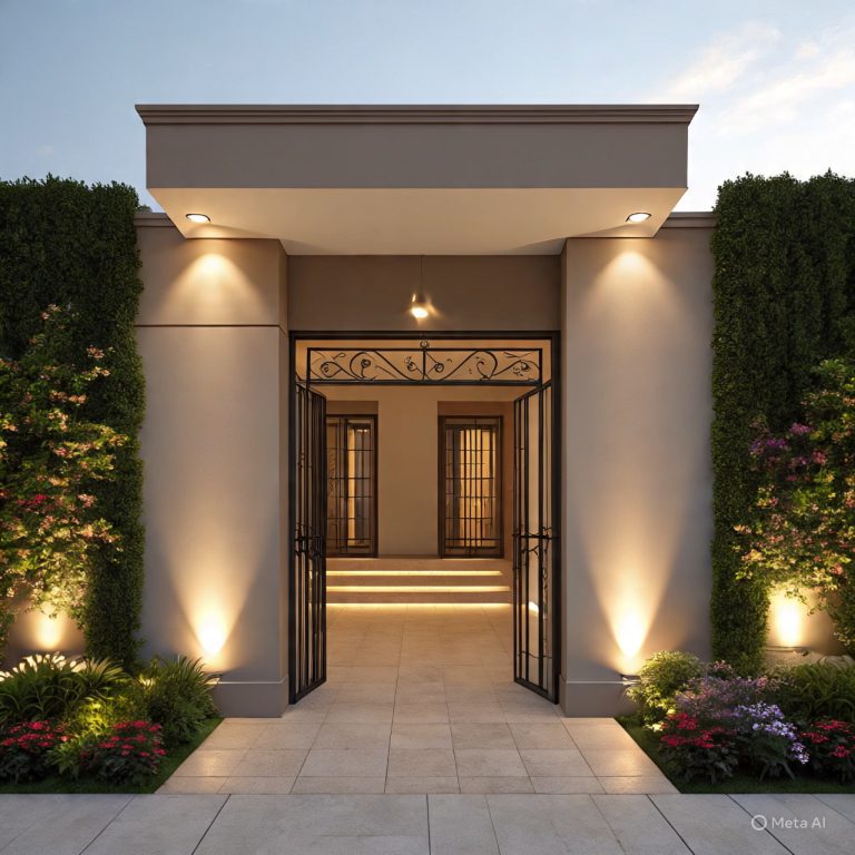
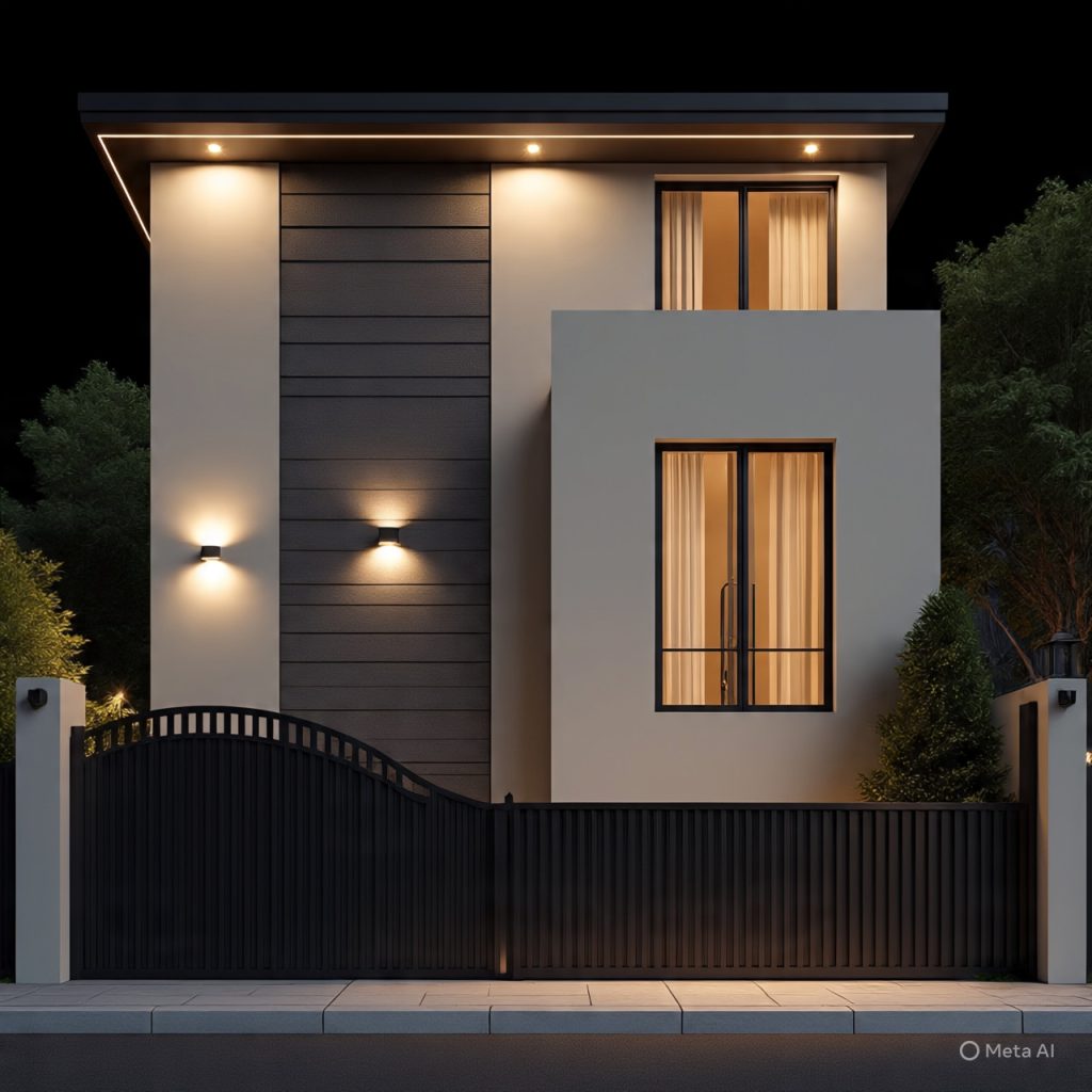
4. Does lighting matter for a two color house front?

Absolutely. Proper lighting enhances contrast and highlights color combinations, making a two color house front look most elegant at night.
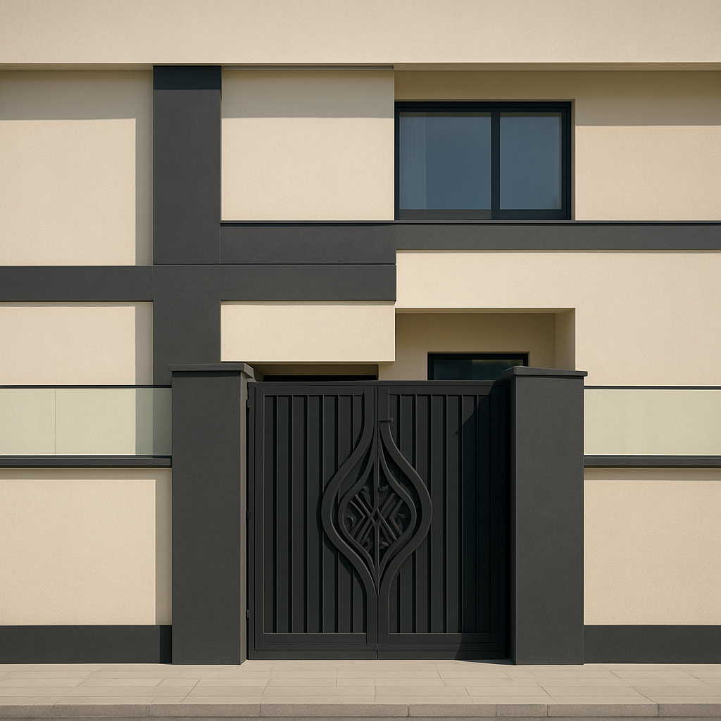
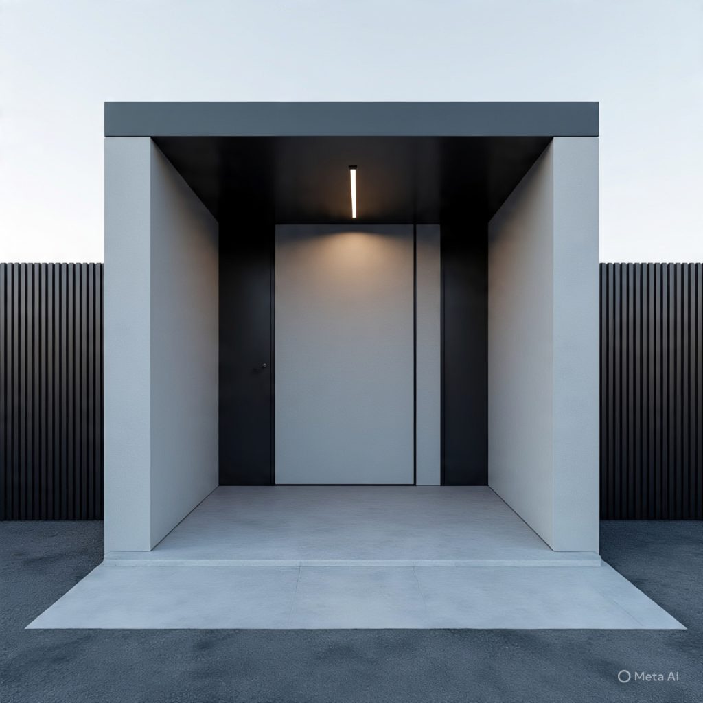
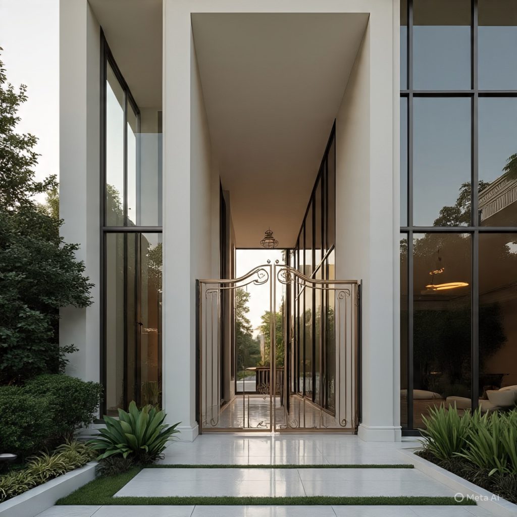
5. The Role of a Premium Main Gate.

A beautiful gate is the “jewel of the front elevation.”
Wood-texture, bronze finish, or matte black gates look luxurious when paired with two-tone backgrounds. The gate must complement both shades smoothly.
6. Texture Matters: Smooth vs. Stone.

Combining smooth plaster with stone cladding or tile texture adds richness. Light color on the smooth area + dark color on the textured area creates perfect balance.
7. Vertical and Horizontal Lines in Two Colors.

Using two tones along structural lines enhances the geometry. Horizontal color division widens the look, while vertical division gives height and prestige.
8. Using Wood Accents with Two Colors.
Wood-styled panels or slats pair beautifully with almost all two-color palettes, especially off-white + walnut or grey + cedar.
9. Modern Minimalist Two-Tone Designs.
Minimalist palettes like white + charcoal or cream + sand look clean and contemporary. Less detail, more elegance.
10. Nature-Inspired Combinations.

Earthy brown + olive green, sand + clay, or grey + forest green create harmony with gardens and outdoor spaces.
11. Bold Style Choices.

Dark maroon + beige, navy blue + light grey, and black + tan are confident combinations for homeowners who want a strong statement.
12. Mediterranean Two-Color Elevations.

White + blue, cream + terracotta, or beige + olive produce a relaxed, sun-washed Mediterranean charm.
13. Modern Urban Two-Tone Pairings.

Charcoal + concrete grey, sand + ivory, or white + stone beige fit exceptionally well in modern city houses.
14. Highlighting Windows and Frames.

Window frames in charcoal or dark brown stand out beautifully against light wall colors. The frame color acts as a third silent enhancer.
15. A Timeless Two-Color Front for Every Home Size.
Whether small or large, a two-color elevation always looks proportional, stylish, and easy to maintain — a long-term design investment.
Final Thoughts:
A two color house front is one of the most versatile and timeless ways to elevate your home’s personality. With the right palette, modern lighting, and a beautifully designed gate, even a simple structure transforms into a premium architectural statement. Whether you prefer minimalist, earthy, bold, or Mediterranean styles, two colors offer endless creative possibilities — stylish today and elegant for years to come.