Front Elevation Color Psychology: How Colors Shape Your Home’s First Impression.
Colors are the most visible and emotional aspect of any home’s front elevation. The right combination can enhance aesthetics, convey personality, and even influence mood. Front elevation color psychology explores how different hues, contrasts, and tones affect perception, helping homeowners make strategic choices that balance beauty and functionality. From selecting accent shades to matching materials, understanding the psychology of color ensures your home leaves a lasting first impression.
1. First Impressions Matter.

The façade is the first thing visitors notice. A carefully chosen palette in front elevation color psychology can make a home feel welcoming, elegant, or modern. Even subtle changes in tone can dramatically alter how the structure is perceived, so deliberate color planning is essential.
2. Light vs. Dark Hues.

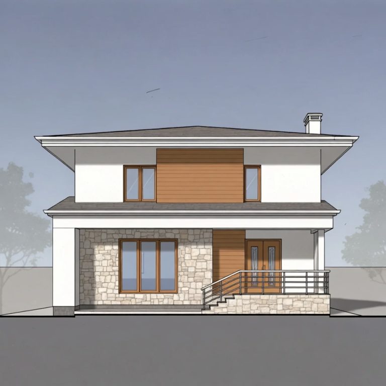
Light colors make narrow or small façades feel larger and airy, while darker shades add a sense of solidity and sophistication. In front-elevation color psychology, pairing a light base with dark accents creates a balanced and visually pleasing contrast, enhancing depth without overwhelming the eyes.
3. Warm Colors for Inviting Homes.

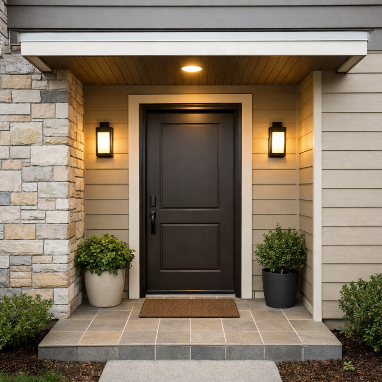
Warm shades such as beige, terracotta, and soft yellows evoke comfort and approachability. Applying these tones in front-elevation color psychology encourages a friendly and cozy atmosphere, especially when used on walls, trims, or entryways.
4. Cool Colors for Calm and Modern Appeal.

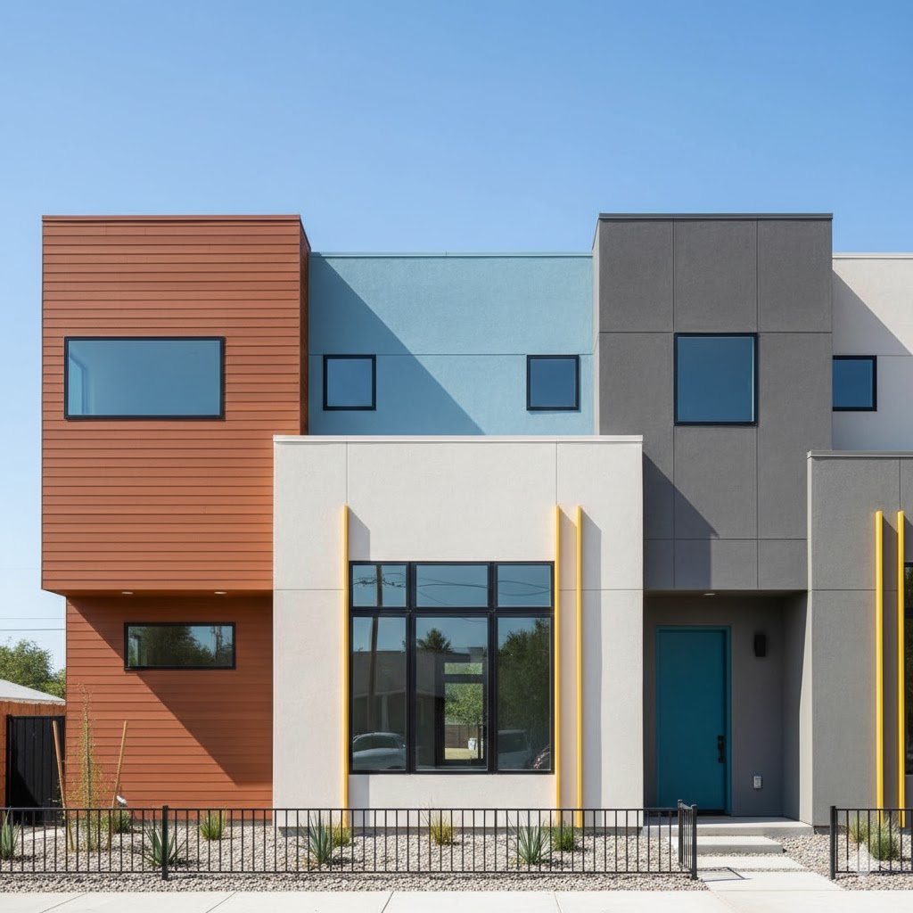
Cool tones like blues, soft greys, and muted greens bring a serene and contemporary feel. In front elevation color psychology, these shades work well for minimalist designs or urban settings, providing a calm backdrop that highlights architectural details.
5. Strategic Use of Accent Colors.
Accent colors highlight features such as balconies, window trims, or columns. Using front elevation color psychology, you can draw attention to key elements without relying on elaborate materials or excessive ornamentation, keeping the design both modern and budget-friendly.
6. Harmonizing Colors with Materials.

Stone, metal, wood, and plaster interact differently with color. Front elevation color psychology emphasizes matching colors with material textures to ensure harmony. For instance, a natural stone base pairs well with muted tones, while metal trims complement darker or bolder shades.
7. Cultural and Regional Influences.

Certain colors have cultural or regional significance. Incorporating front-elevation color psychology in alignment with local traditions ensures your design feels familiar and respectful while maintaining contemporary aesthetics.
8. Lighting and Seasonal Effects.

Exterior colors can look different depending on sunlight, shade, and season. In front elevation color psychology, testing shades at various times of day ensures that walls, trims, and features consistently convey the intended mood.
9. Neutrals for Timeless Elegance.

Neutral colors—white, cream, grey, taupe—are versatile and timeless. Applying front elevation color psychology, neutrals form a sophisticated base that allows accents to pop, reduces visual clutter, and adapts well to changing trends.
10. Bold Colors for Statement Homes.

Bright colors like reds, deep blues, or burnt oranges can create a dramatic impact. Using front-elevation color psychology, these shades should be applied thoughtfully, often as accents or selective walls, so they make a statement without overpowering the overall design.
11. Balancing Multiple Shades.

Too many colors can create confusion or visual noise. Front-elevation color psychology recommends limiting palettes to 2–3 complementary shades. This approach maintains coherence, highlights architecture, and ensures each element contributes to the overall aesthetic.
12. Psychological Impact of Color Choice.
Colors evoke emotions—warm tones feel inviting, cool tones calming, neutrals reliable, and bold shades energizing. Understanding these psychological effects in front-elevation color psychology enables homeowners to create façades that communicate personality and mood even before guests step inside.
How Color Psychology Affects Front Elevation Design
Color is not just a visual choice. It directly affects how people feel when they see your house.
Different colors trigger different emotional responses. This is why some houses feel calm, some feel premium, and some feel uncomfortable without any obvious reason.
Color psychology plays a major role in:
- first impression
- curb appeal
- perceived house value
- emotional response
Even before entering your home, people subconsciously judge it based on color.
Meaning of Popular Front Elevation Colors
White – Clean, Spacious, Modern
White represents simplicity, cleanliness, and openness. It makes houses look bigger and more refined.
- ideal for small houses
- works with all styles
- reflects light and creates brightness
White is one of the most commonly used exterior colors because it feels fresh and timeless.
Grey – Modern, Balanced, Sophisticated
Grey gives a neutral and modern appearance.
- creates a calm and stable look
- works well in urban environments
- pairs easily with other colors
Grey is often used to add structure without making the design too bold.
Beige / Earth Tones – Warm, Natural, Timeless
Beige and earthy shades create a warm and welcoming feel.
- connects house with surroundings
- looks soft and balanced
- hides dust better than white
Neutral tones like beige are widely preferred because they offer broad appeal and stability.
Black – Bold, Premium, Strong
Black creates a strong and modern impression.
- highlights structure and geometry
- adds depth and contrast
- looks premium when used correctly
However, overuse can make the house feel heavy.
Blue – Calm, Peaceful, Trustworthy
Blue is associated with calmness and stability.
- ideal for peaceful and relaxed homes
- works well in coastal or modern designs
- creates a soothing effect
Cool colors like blue are known to create a relaxing and calm environment.
Green – Natural, Fresh, Balanced
Green connects the house with nature.
- creates a peaceful and refreshing look
- blends well with plants and landscape
- feels organic and modern
Green tones are increasingly popular due to nature-inspired design trends.
Red – Bold, Energetic, Welcoming
Red is powerful and attention-grabbing.
- creates strong first impression
- feels warm and inviting
- best used as an accent color
Red is often used to enhance curb appeal and make entrances stand out.
Warm vs Cool Colors in Front Elevation
Understanding this is VERY important.
Warm Colors (Red, Yellow, Orange)
- energetic
- welcoming
- attention-grabbing
Cool Colors (Blue, Green, Purple)
- calming
- relaxing
- subtle
Neutral Colors (White, Grey, Beige)
- balanced
- timeless
- safe choice
Each category creates a completely different mood for your house.
How to Use Color Psychology in Your House Front
Instead of randomly choosing colors, apply this logic:
- choose base color based on house size
- use accent color to create focal point
- balance warm and cool tones
- avoid too many colors
The goal is not to use trendy colors, but to create a controlled emotional experience.
Common Color Psychology Mistakes
- choosing colors only because they look good online
- ignoring lighting conditions
- using too many strong colors
- not matching with materials
These mistakes break visual harmony and reduce the overall impact.
Final Insight
Front elevation color is not just design—it is communication.
Every color sends a message about your house.
Clean, modern, bold, calm, premium—it all starts with color.
The best elevations are not the ones with the most colors,
but the ones where color is used intentionally and strategically.
In my experience, a well-balanced front elevation design creates both visual appeal and long-term value. Use this guide as a foundation, adapt it to your needs, and build a design that feels modern, practical, and timeless.